Students uncork creativity in wine label design competition
AcademicsOther
23 April 2026
By Gerrit Bester
Mpilo Mthembu, a talented third-year Integrated Communication Design student from the Department of Visual Communication at TUT, won first prize in the fourth ROTOCON Wine Label Design Competition.
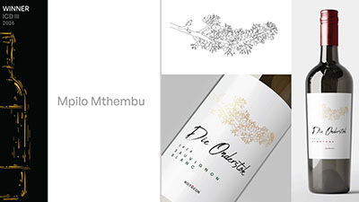 Mpilo Mthembu’s winning design, named Die Onderstok.
ROTOCON, in collaboration with the Tshwane University of Technology (TUT), SA Litho Label Printers and Polyflex Premedia, announced this year’s winners at an event hosted at the Irene Farm on 17 April.
Mpilo Mthembu’s winning design, named Die Onderstok.
ROTOCON, in collaboration with the Tshwane University of Technology (TUT), SA Litho Label Printers and Polyflex Premedia, announced this year’s winners at an event hosted at the Irene Farm on 17 April.
The competition was open to undergraduate students in TUT’s Department of Visual Communication (Integrated Communication Design), Faculty of Arts & Design. Fifty-seven students participated, some of whom produced designs of such high quality that the judges deemed them ready for commercial production.
Mthembu described the inspiration for her design, named Die Onderstok, as follows: “Die Onderstok is directly translated into Afrikaans from the term ‘the rootstock,’ referring to the rootstocks that the South African Pinotage wine cultivar was grafted onto to help it survive and multiply after it nearly died out. The wine honours the significance of the Pinotage and South Africa's wine industry to its people, to its heritage and to its representation on a global scale, showing that sometimes innovation isn't about abandoning the old for the new, but most importantly about crafting new beginnings from strong rootstocks,” Mthembu said.
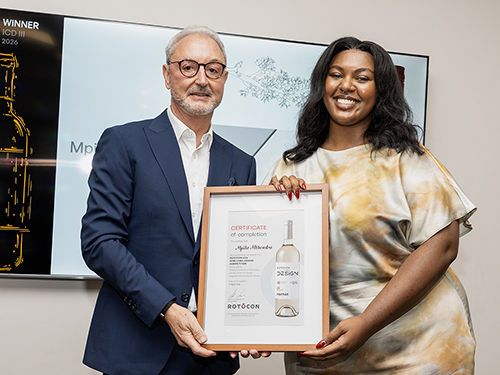 Mpilo Mthembu with Michael Aengenvoort, ROTOCON Group CEO.
“I’m very proud of this award and I’ve learned a great deal about the industry through the research I did for my winning design.” She won R30 000.
Mpilo Mthembu with Michael Aengenvoort, ROTOCON Group CEO.
“I’m very proud of this award and I’ve learned a great deal about the industry through the research I did for my winning design.” She won R30 000.
The runner-up was Kara-Mari Gresse with a design called Boerperd, while Itumeleng Mohlala bagged third place with her design, Boulders. They received prize money of R15 000 and R10 000, respectively.
Ntokozo Tshabalala received a special award, the Creative Courage Award, for his design, called TIE. He received R5 000.
Banie Stafford of B Creative, ROTOCON’s marketing agency, led the competition and facilitated sessions with the students, covering an introduction to ROTOCON, printing processes and embellishments, as well as key wine label design elements, including paper, colour use, die-cutting and typography – concluding with the importance of knowing your target market.
This year’s design theme was A New Vintage of Vision, reflecting a new generation of designers shaping the future of wine branding.
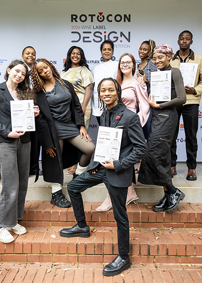 A proud Prof Nalini Moodley, Executive Dean of the Faculty of Arts and Design, posing with the top performing students in this year’s competition.
Joining Stafford on the judging panel held on 16 April were Michael Aengenvoort, ROTOCON Group CEO; Dawrian Salies, General Manager of SA Litho Label Printers; and Stuart Baylis, Group Operations Manager of Polyflex.
A proud Prof Nalini Moodley, Executive Dean of the Faculty of Arts and Design, posing with the top performing students in this year’s competition.
Joining Stafford on the judging panel held on 16 April were Michael Aengenvoort, ROTOCON Group CEO; Dawrian Salies, General Manager of SA Litho Label Printers; and Stuart Baylis, Group Operations Manager of Polyflex.
SA Litho Label Printers will print the winning labels from the competition.
All the winners will be flown to Cape Town for a factory tour of SA Litho Label Printers where their winning labels will be printed. They will also be recognised at the WineLand Media 30 Under 30 Awards on 5 June. ROTOCON is sponsoring this event for the seventh consecutive year.
“This competition is about more than design, it’s about shaping industry-ready thinkers,” said Stafford. “And this year’s group delivered exactly that.”
In a heartfelt speech, Craftsmanship endures: Excellence is a daily practice, Aengenvoort told students that there’s a myth in creative work that great ideas arrive fully formed.
In fact, he said, it’s all about layering. “It’s the first sketch that’s a bit boring, the second one that’s too much, the third that almost works, and the fourth where you sit back and say: Okay, now we’re cooking with gas.”
He added that a wine label is more than a decoration but “the handshake before the conversation, the cover of the book and the first note before the cork is pulled.”
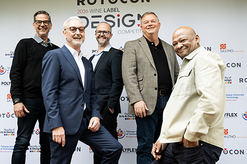 Pictured at the event (from left) are Banie Stafford (B Creative), Michael Aengenvoort (ROTOCON), Dr Schalk van Staden (TUT Department of Visual Communication), Stuart Baylis (Polyflex) and Dawrian Salies (SA Litho Label Printers).
He said design students often ask: How do I know if my design is good? “The honest answer is that the shelf will tell you. The shelf is ruthless. It does not care about your concept statement, how late you worked, nor that the printer changed something. The shelf only cares about contrast, legibility, balance and whether your design still works when it’s printed thousands of times.”
Pictured at the event (from left) are Banie Stafford (B Creative), Michael Aengenvoort (ROTOCON), Dr Schalk van Staden (TUT Department of Visual Communication), Stuart Baylis (Polyflex) and Dawrian Salies (SA Litho Label Printers).
He said design students often ask: How do I know if my design is good? “The honest answer is that the shelf will tell you. The shelf is ruthless. It does not care about your concept statement, how late you worked, nor that the printer changed something. The shelf only cares about contrast, legibility, balance and whether your design still works when it’s printed thousands of times.”
Aengenvoort continued to tell the young designers that “nice” is a very dangerous place in design. “Nice doesn’t upset and excite anyone. Nice disappears the moment someone reaches for another bottle. Craftsmanship, however, moves work from nice to memorable.”
“Every piece of work that lasts longer than a trend exists because someone chose daily practice over occasional brilliance. So, don’t rush your process. Don’t apologise for caring. Don’t underestimate how far consistency will take you. Craftsmanship endures, excellence compounds and work done with care always finds its audience, even if it takes time,” he concluded.
- Headquartered in Hamburg and Cape Town, with branches in the USA, Johannesburg, Durban and Asia, ROTOCON specialises in delivering customised turnkey solutions to the label printing and packaging industry. The company designs and manufactures a broad range of printing, converting, finishing and ancillary equipment, balancing high quality with competitive pricing. By understanding each customer’s unique production environment, ROTOCON provides tailored recommendations that meet specific operational needs.
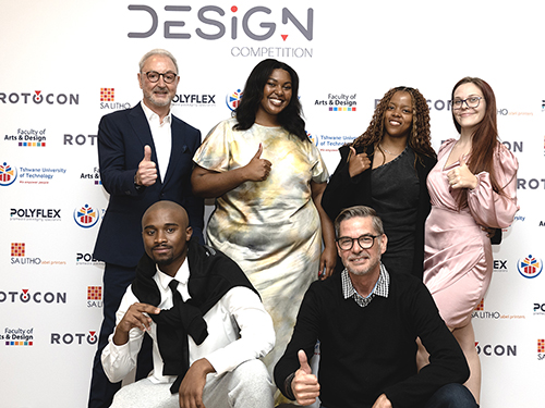 Michael Aengenvoort (ROTOCON) and Banie Stafford (B Creative) posing with the Top 4, Mpilo Mthembu, Itumeleng Mohlala and Kara-Mari Gresse (back), and Ntokozo Tshabalala (front).
PHOTOS: Thembisa Ncokwana and Nkhodi Mthimuye